HealthManagement, Volume 14 - Issue 2, 2014
Authors:

Introduction
A Japanese Samurai carried seven tools with him in preparation for battle. This historic tradition was modernised by Japanese businessman Kaoru Ishikawa, who utilised and promoted seven quality tools. While Ishikawa believed that management should allow employees to self regulate their own productivity, he also proposed that management should be able to illustrate to employees their own weaknesses (Watson 2004).
These seven quality tools are the fundamental basics for statistics; however, they enable a user without a background in statistical analysis to make quality control comprehensible. These tools can be used as a systematic way to understand reasons for quality variation as well as establishing relationships between them (Ho 1999). Ishikawa also believed that these seven tools could solve 95% of a company’s problems.
As most radiologists are aware, the world of radiology is rapidly evolving due to advancing technology and cost awareness. There has been a demand for increasing efficiency and minimising costs, similar to the demands of a thriving business or practice. These seven quality tools can allow a radiologist to become fluent in the language of quality. This will allow for more meaningful participation in hospital and accountable care organisation (ACO) quality initiatives.
Histograms
Introduced by Karl Pearson in 1891, the histogram was used to demonstrate the reign of different prime ministers. It is thought that the word is derived from the Greek word ‘histos’, which means ‘anything set upright,’ such as the mast of a ship. While these tabulated frequencies can appear similar to a bar chart, bar charts show categorical data to visually compare categories, with height corresponding to the value of each category. In a histogram, the total area of the bar indicates the frequency of occurrence for each data interval.
The histogram is a visual representation of continuous data, which show the proportion of cases that fall within the organised categories. A normal distribution of data will appear as a bell curve. The data is first split into discrete, non-overlapping intervals, which are called bins. Each individual piece of data is sorted into a bin, and the n umber of occurrences in each bin is tabulated into a frequency.
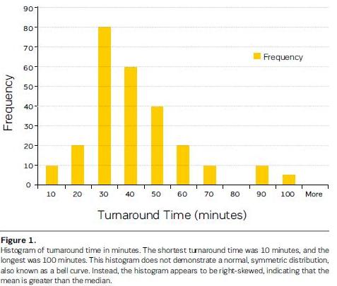
In the radiology department, the histogram can be applied to assess numerical data. This can include the distribution of call volume, radiation doses, and turnaround time. For example, if the radiology department were to receive complaints about long wait times for generated reports, a histogram could be constructed to show the underlying frequency distribution (Figure 1). Prior to this graph, it was assumed that all exams were read mostly within 45 minutes. In actuality, the turnaround times fell between 10 and 100 minutes; however, the majority of exams were read within 30-40 minutes. Twenty-five out of 255 exams were read between 70-100 minutes, causing the distribution to appear right-skewed. These larger values have caused the mean to be greater than the median and may warrant further investigation. However, it should be emphasised that histograms are most accurate when the process is stable (Tague 2005). Turnaround time can appear increased in the presence of computer malfunctions and faulty equipment.
Control Charts
Walter A. Shewhart, a physicist and mathematician who was working at Bell Telephone Research Laboratories, implemented the control chart to distinguish between the two categories of quality variation, assignable cause and chance cause (Best and Neuhauser 2006). Chance cause leads to variations of a process, which are uncontrollable. Assignable causes, on the other hand, can improve a process once identified (Best and Neuhauser 2006). The radiology practice or department often encounters chance causes in their day-to-day workflow, such as user variability in machinery and operation. Assignable but correctable causes in the radiology practice or department would include faulty machinery.
The control chart aims to distinguish chance cause from assignable causes of a process over a period of time. Based on historical data, the upper and lower control limits are set to three standard deviation units with the average set as the central line. These limits define whether the current event is ‘in control’, consistent, or ‘out of control’, unpredictable. If a process is assumed to be stable, then any process that falls out of control may warrant investigation.
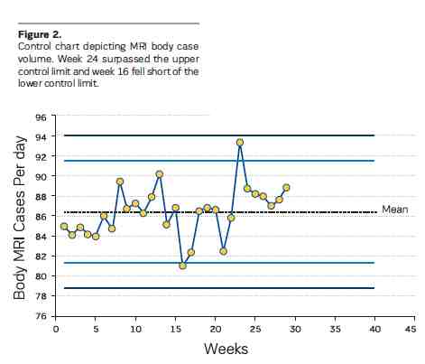
For example, high case volume is important for an imaging centre. To monitor the case volume, a control chart could be constructed as shown in Figure 2. If there are too many studies on a certain day, then there will be a point that surpasses the upper control limit. If there are too few studies on a certain day, the lower control limit will be surpassed. In this example, the MRI case volume was monitored over a period of weeks. There were only two points, week 16 and 24, where the process was out of control. While week 24 had an exceptionally large case volume, week 16 may require investigation since the number of cases fell short compared to the historical average.
Pareto Analysis
The Pareto chart was based on an observation made by Italian engineer and economist Vilfredo Pareto that 80% of the land in Italy was owned by 20% of the people. Also known as the 80-20 rule, the Pareto principle showed that, for any series of variables, a small number will be the cause for most of the effect (Harry et al. 2010). This rule can be applied to a radiology practice so that 80% of problems are attributed to 20% of the causes. In order to identify these potential causes, a cause and effect diagram, another tool described below, can be used.
In order to create a Pareto chart, the data is sorted into categories and arranged by decreasing count. Causes are plotted on the x–axis and cumulative percentages on the y-axis; the points are joined to form a curve. A bar graph is also plotted with causes on the x-axis and frequency on the y-axis, with the bars on the far left being the tallest.
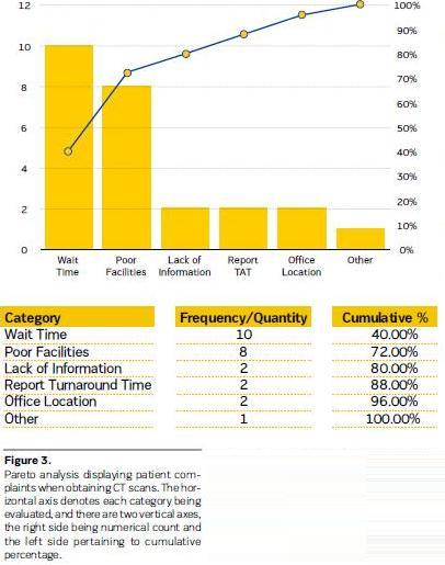
The goal of a Pareto chart is to focus on the most significant problem. For example, when evaluating the types of complaints received by the radiology department, it is important to determine what are the most common complaints and how often they occur compared to other less frequent complaints (Figure 3). Resolving the complaints that have the most impact will lead to the greatest benefit. In this example, the types of complaints concerning the radiology department were categorised and counted. The two largest categories were wait time and poor facilities. If both of these categories were improved through better communication and increased facility upkeep, 72% of the problems could be solved, by fixing 28% of the complaints. The effect would be different if attempts were made to resolve office location, which may require the patient to go to a different facility or location. If the office site were relocated, this would only solve 4% of the department’s problems.
Cause and Effect Diagrams
Also known as the Fishbone diagram, Ishikawa himself has been credited for creating this concept (Watson 2004). The main problem is identified with a horizontal line, the ‘spine,’ running through it. Main causes and sub causes to this problem are drawn as ‘fish bones’ arising from the ’spine‘. The potential causes can then be potentially grouped together. Ideas that are lacking in a certain area will be illustrated as gaps within the diagram.
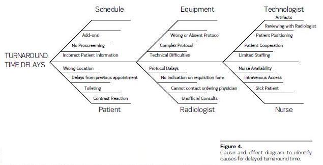
Cause and effect diagrams are best used for brainstorming. While the previous tools may help to identify a problem, this tool can be used to think of solutions or reasons for that problem. Issues such as decreased MRI case volume, increased turnaround time, long wait times, and poor facilities can be explored further using this technique. For example, to identify causes for delayed turnaround time, six major causes were identified (Figure 4). This included scheduling, patients, radiologists, nurses, technologists, and equipment. Multiple sub-causes have been identified for each of these categories. However, this tool cannot show which cause is more significant. To fully illustrate which of these causes would have the largest impact if fixed, a Pareto chart may be warranted.
Scatter Plots
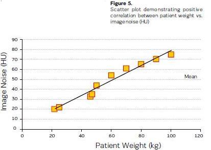
The scatter plot is a classic method to depict a trend in data by showing how one variable (x-axis) is affected by another variable (y-axis). If there is a pattern, then the plotted data points will form a sloped line or curve. However, a pattern does not suggest that there is a relationship between the x and y variables, only that there is a correlation. A third variable may be present, affecting the two other variables. The correlation between these two variables can be deemed as positive, negative, or no correlation (Mikel 2010). A positive correlation exists when the increase of one variable corresponds with the increase of the other variable. A negative correlation exists when the increase of one variable corresponds to the decrease of the other variable. If the plotted points on the scatter plot appear randomly distributed, then no correlation is demonstrated.
The scatter plot is useful when causes have been generated (i.e. cause and effect diagram) and the most significant cause has been identified (i.e. histogram, Pareto chart). For example, if the radiology department noticed that certain images were difficult to read due to image noise, a scatter plot of patient weight and image noise could be examined. As shown in Figure 5, there is a positive correlation between the two variables. Based on this correlation, subsequent protocols could be customised for overweight patients to improve image quality.
Check Sheets
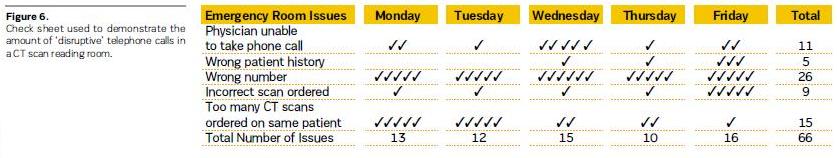
While check sheets are often confused for grocery checklists, this tool is used to ensure that tasks are completed in a reproducible and repeatable fashion. Quality control is often difficult to assess due to data collection errors, which include, but are not limited to, inaccurate data entry and poor handwriting. The check sheet decreases the chance of human error by standardising a form.
For example, when attempting to document disruptive phone calls to the CT reading room, a check sheet would be an optimal tool (Figure 6). The check sheet should be used over a period of time, such as a week, so that issues can be documented in a consistent manner. In this example, the most frequent disturbance to the reading room was the wrong number being dialled, which was later shown to be an incorrectly listed phone number on the hospital directory website. Therefore, this tool is ideally used for gathering data to be subsequently analysed with the aforementioned tools.
Stratification
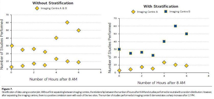
Stratification aims to categorise and separate raw data from a variety of sources. It is a technique used with other data analysis tools, such as a scatter plot or histogram, to elucidate a pattern. For example, when a scatter plot was constructed to show the relationship between the number of exams performed and time of day, there appeared to be no correlation between the two variables (Figure 7). It was then observed that, if the number of exams was separated by different imaging centres, a correlation could be demonstrated with both imaging sites. Both centres showed a positive correlation, meaning as the day progressed, more exams per hour were performed. However, after 12 PM, there was a sharp increase in the number of studies performed at imaging centre B. It can then be assumed that imaging centre B may benefit from more coverage later on in the day.
Conclusion
Originally used as tools that delivered companies better profits and higher quality, the Magnificent Seven can be used by radiologists to improve work efficiency and outcomes. These seven quality tools can empower radiologists to perform required quality activities, succeed as a member of interdisciplinary quality teams, and shape our future.
References:
Best M, Neuhauser D (2006) Walter A Shewhart, 1924, and the Hawthorne factory. Qual Saf Health Care, 15(2): 142-3.
Harry MJ, Mann PS, De Hodgins OC et al. (2010) Practitioner’s guide to statistics and lean six sigma for process improvements. Hoboken, NJ: John Wiley & Sons, Inc.
Ho SKM (1999) Operations and Quality Management. London, UK: International Thomson Business Press.
Kruskal JB, Eisenberg R, Sosna J et al. (2011) Quality initiatives: quality improvement in radiology: basic principles and tools required to achieve success. Radiographics 31(6): 1499-509.
National Institute of Standards and Technology (2012) NIST/ SEMATECH e-handbook of statistical methods. [online] Available from http://www.itl.nist.gov/div898/handbook [Accessed: 21 January 2014
Rooney JJ, Kubiak TM, Westcott R et al. (2009) Building from the basics. Quality Progress, 42(1) 18-29.
Tague NR (2005) The quality toolbox. 2nd ed. Milwaukee: ASQ Quality Press.
Tamm EP, Szklaruk J, Puthooran L et al. (2012) Quality initiatives: planning, setting up, and carrying out radiology process improvement projects. Radiographics, 32(5): 1529-42.
Watson G (2004) The legacy of Ishikawa. Quality Progress, 37(4): 54-7.